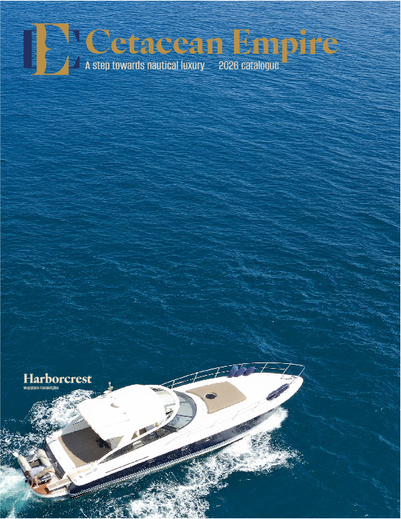
Cetacean Empire Logo
Rational
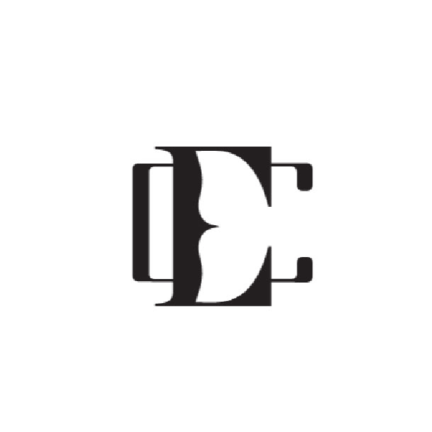
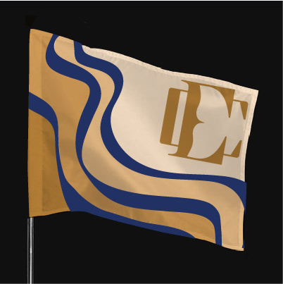
The lettermark combines the “C” and “E” to reflect the brand’s cetacean inspiration while creating a distinctive and cohesive visual mark. Through the use of negative space, the forms subtly reveal both a whale tail and a propeller shape, visually linking the identity to marine life and nautical travel. This layered symbolism reinforces the brand’s connection to the ocean while maintaining a clean and memorable design. The use of gold and royal blue strengthens the brand’s luxurious tone, while also referencing the deep blues of
the sea and the prestige often associated with maritime travel. Together, these elements create a refined identity that balances elegance with a clear thematic connection
to the ocean.
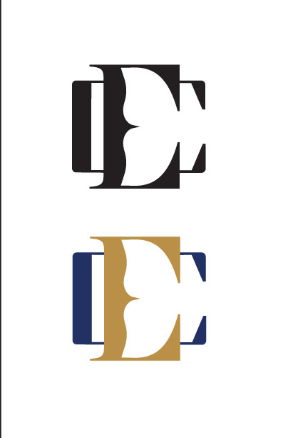
Credit
Extension Photography- Adobe Stock
Extension Photography- Adobe Stock
Logo in Work
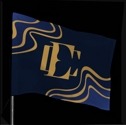


Process